-
 READ MORE
Given human inquisitiveness, we are always keen to learn about other people, whether in a different country, culture, religion, or line of employment. That is why “A Day In The Life Of…” articles are so popular, and so we thought we would satisfy some of that curiosity with this “A Day In The Life Of Web Designers” article.
As for those who might be interested in reading such an article, we assume them to be anyone considering a career as a web designer, people who are interested in all things relating to creativity or online design, and those who like to absorb as much information as they can, regardless of the subject matter.
One thing we must point out about a web designer’s day is that it will differ in many ways from lots of other employment types. Given that it involves creativity, technical skills, business acumen, and even a degree of sales ability when trying to secure clients, it is not a role where you can say for certain what each day is going to contain.
An extreme comparison would be someone who works in a manufacturing facility and who has a specific role in the making of a product. Their job on the assembly line might be vital; however, it is safe to say that each day will more or less include the same tasks to complete, similar problems to resolve, and working with the same people.
Conversely, web designers will undertake dozens of different tasks as part of the design and creation of a website, no two websites will be the same, and no two clients will have the same requirements. As such, rather than state what a web designer will do each hour of the day, we are going to highlight the main tasks that a web designer may complete as part of any working day.
Planning And Organisation
An essential part of any role, and certainly for web designers, is planning and organisation. Web designers will plan their day as to what tasks they are going to complete, arrange meetings, and ensure that they have all the tools and resources necessary to remain on track.
-
 READ MORE
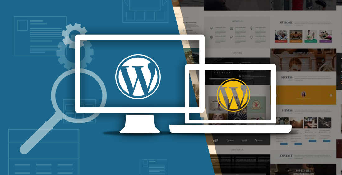
With the immense amount of resources at your fingertips, creating an attractive WordPress website that looks great has never been easier. However web designers advise that building a website that’s search engine and user friendly is about more than just looks. If your site doesn’t function right, then people won’t hang around and you’ll develop a poor reputation in the web space.
Luckily for you, there’s a few small things that you can do behind the scenes to improve the performance of your website dramatically. The three tips listed below will help you speed up your website, improve the user experience and ultimately, will help you achieve a lower bounce rate and a higher visitor retention rate.
- Make Sure You Use A Good Hosting Provider!
If you’re running on a tight budget and trying to create a website that doesn’t cost a fortune, then it can be tempting to try and save as much money on hosting as you can. I mean, there’s even a few free WordPress hosting providers out there, so you may as well use them, right?
Wrong!Don’t fall into the trap of using a cheap or free hosting provider who doesn’t allocate enough resources to your website and who doesn’t guarantee at least 99.9% uptime. Using a good hosting provider will improve your page load times, will make sure that your website is always accessible and will help improve your reputation in the competitive digital space.
-
 READ MORE
Freedom that is free of responsibilities can make one oblivious of one’s image in society. Similarly a website with all the bells and whistles attached, but poor in content and focus will hardly be noticed on the web. In our endeavour to create a lasting impression, one tends to exhaust all options available without really thinking about the need for such garish features.
Since reading from a web page can be more difficult than that from a printed document, the background colour for the website must be such that the text is readable with minimum effort. While superimposing text on to graphics, the text should still be clearly visible.
Restrict the urge to put in the flashiest of graphics. Flash player is a tool that has been developed from a basic code that is well suited for web applications. But Flash on its own does not display well on many of the sites. Do not prompt the users to download the latest versions of plugins, since they might just move on to another site in disgust. Also, beware of using too many animated graphics to promote products which may be totally unrelated to the site, but whose endorsement you have been paid for. Viewers visit a website with a specific purpose and don’t like to be bombarded with unwanted information.
-
 READ MORE
English may be the most common language acceptable to a majority for their daily communication. But there are still a vast number of people who do not use English, like the French and the Japanese, since they would rather get the whole world to learn their language. If you want to overcome such barriers be ready to put in special efforts.
The problem with language translation is getting the right sentence. The most popular translation tools are offered by Google, WorldLingo, and Yahoo Babelfish free on the web. One method would be to add a link on your site to the web tools available. All the users have to do is to type in the URL in the appropriate box and select the language in which they want to read. Do it yourself on a regular basis and confirm that the translated form of the web page represents actual facts that you wish to convey. As far as possible, use words, which are most likely to be understood by these tools.
Avoid pronouns, which do not address clearly the object of reference. Keep the sentences simple and of medium length. All said and done, these online tools may be unable to translate some words, and either leave those words untranslated or marked with empty spaces. Besides, there are so many words which sound and mean quite similar. In many languages, the different combination’s of some words may mean very different. In addition, such software may not comprehend latest words added to the vocabulary or slang.
-
 READ MORE
The task of designing a website is incomplete without putting images on its pages. However you need to be careful choosing the image format that you intend using.
There are currently three types of image formats which are supported by all the browsers. They are JPEG (joint photographic experts group), GIF (graphic interchange format) and PNG (portable network graphics).
The JPEG format is suitable when you have to use many colors for one image. However, it cannot be used for images which have text with photographs. In the JPEG format the photographs may look blurred. The GIF format is used when there is a less number of colors involved as it has a limitation of 256 unique colors.
Usually GIF format reflects pixelated images which affect the beauty of photographs and therefore this format is not preferred. Thus the Portable Network Graphics or the PNG came into existence when the GIF format started showing shortcomings – leading to its decreasing use by the web designers and developers across the world.
On the other hand, a wide variety of images can be stored in the PNG format. Initially the most popular browser, Microsoft Internet explorer (IE), was incompatible for this file format. But as soon as IE7 came out with other java script hacks, PNG format became very effective. Thus the PNG images certainly have some clear advantages over the GIF format.
Let us discuss in detail why the PNG images will best suit your requirement for designing an excellent website.
-
 READ MORE
We had to wrinkle our nose at this post on 6 famous web design atrocities. It may be more about which re-designs caused the most backlash – draw your own conclusions – but the overall sites seem to be doing fine regardless.
Gawker – Wait, what changed? We barely noticed.
TechCrunch – Look, any guru worshiped by his own personal cult can’t be said to fail at anything.
StumbleUpon – Guilty as charged, but Stumble has been concentrated on shooting themselves in the foot since they grew beyond being a Firefox plugin. Whatever they do to their site doesn’t matter now.
Netflix – Again, people still flock there.
YouTube – Ditto. And again, we barely detect any change since Google bought it.
Target – Hey, they’re a brick-and-mortar store. Do they even care about web traffic?
Still, it’s a good guide to what your user base might backlash about. Our take-away: Prioritize function over style. -
 READ MORE
Parallax
prognosis: Rapidly fading fadWhile Web Design Ledger gives us beautiful examples of site layouts that incorporate parallax scrolling in their new styles in web design, we’re going out on a limb to suggest that it might not be here to stay. While it’s a very hip style, it’s fraught with compatibility issues for mobile devices and old browsers – and it takes a real rockstar designer to pull off, a huge investment in effort for a very small return. Artists have one more toy for their portfolios.
Microsoft Metro inspired minimalism
prognosis: Squares are popular againBig deal, squares and plain colors. We’ve been fighting to get away from this for a decade and now we’re back to it. Techihawk has some nice gallery examples, but we’ve seen this play out before: Minimalist movements quickly become “maximalist” trends, as more stuff gets crammed into the interface until it looks just as crowded as any page ever done by somebody who’s never used the word “minimalism”. So what’s the difference?
-
 READ MORE
It is better to use HTML, as it is reliable and a versatile language, that can help you code your web pages. It is easy to learn HTML and is very effective in designing the colour, font, and style of the content on the website.
The navigation buttons used on the website should have fewer words written on it, or it will make the content area crowded and not pleasant to the eye.
If you find some problems in loading your website do not give up but look for professional help. At times your website may have a problem to open up in Netscape due to complex designs, however, you can seek a solution by looking out for an expert in web designing.
-
 READ MORE
A website needs a lot of planning and preparation before you actually work on it. Poor planning can lead to a poor website. Have a rough plan ready about the graphics and visuals to be used, the content, font, style, and color. You should also be sure about the number of pages you need to upload, where and how to place the navigation button and so on.
Before you upload your site you need to register for a domain name. It is an address given to your website which can be easily identified among various websites on the Internet. You may not be able to purchase it but can get it on lease for a period of two years.
It is true that pictures are attractive and speak about the product. However, visitors to your website are more interested in your content and do not waste time in uploading pictures that take time to load. Instead, use quality and unique content that will be useful to the reader.
Taking care of these things will help you catch hold of many browsers. However, update your website often, and revamp the website once in a while, to keep the visitors coming back for more.
-
 READ MORE
Are you going crazy because you have tried an unending list of ideas and options to increase the traffic for your website but nothing has really clicked? Well, then here are a few suggestions to make your website viewable and appealing for most web surfers and increase the traffic for your site.
People like to visit pages that are not linked in a confusing manner. It would be great for you to include a site map of your website for the same purpose.
A site map is a simple web page that includes all the sub pages of your website in an organized fashion. This makes it very convenient for the visitor to navigate to the required page and also increases his/her chances of visiting your website again simply because of its user friendliness.
